In the world of investment management there is an oft-discussed idea that blindfolded monkeys throwing darts at pages of stock listings can select portfolios that will do just as well, if not better, than both the market and the average portfolio constructed by professional money managers. If this is true, why might it be the case?
The dart board
Exhibit 1 shows the components of the Russell 3000 Index (regarded as a good proxy for the US stock market) as of December 31, 2016. Each stock in the index is represented by a box, and the size of each box represents the stock’s market capitalization (share price multiplied by shares outstanding) or “market cap” in the index. For example, Apple (AAPL) is the largest box since it has the largest market cap in the index. The boxes get smaller as you move from the top to the bottom of the exhibit, from larger stocks to smaller stocks. The boxes are also color coded based on their market cap and whether they are value or growth stocks. Value stocks have lower relative prices (as measured by, for instance the price-to-book ratio) and growth stocks tend to have higher relative prices. In the exhibit, blue represents large cap value stocks (LV), green is large cap growth stocks (LG), gray is small cap value stocks (SV), and yellow is small cap growth stocks (SG).
For the purposes of this analogy you can think of Exhibit 1 as a proxy for the overall stock market and therefore similar to a portfolio that, in aggregate, professional money managers hold in their competition with their simian challengers. Because for every investor holding an overweight to a stock (relative to its market cap weighting) there must also be an investor underweight that same stock, this means that, in aggregate, the average dollar invested holds a portfolio that looks like the overall market.1
Exhibit 1. US Stocks Sized by Market Capitalization
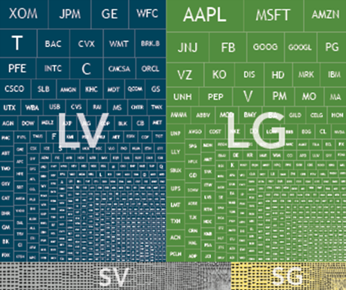
For illustrative purposes only. Illustration includes constituents of the Russell 3000 Index as of December 31, 2016, on a market-cap weighted basis segmented into Large Value, Large Growth, Small Value, and Small Growth. Source: Frank Russell Company is the source and owner of the trademarks, service marks, and copyrights related to the Russell Indexes. Please see Appendix for additional information.
Exhibit 2, on the other hand, represents the dart board the monkeys are using to play their game. Here, the boxes represent the same stocks shown in Exhibit 1, but instead of weighting each company by market cap, the companies are weighted equally. For example, in this case, Apple’s box is the same size as every other company in the index regardless of its market cap. If one were to pin up pages of newspaper stock listings to throw darts at, Exhibit 2 would be much more representative of what the target would look like.
When looking at Exhibits 1 and 2, the significant differences between the two are clear. In Exhibit 1, the surface area is dominated by large value and large growth (blue and green) stocks. In Exhibit 2, however, small cap value stocks dominate (gray). Why does this matter? Research has shown that, historically over time, small company stocks have had excess returns relative to large company stocks. Research has also shown that, historically over time, value (or low relative price) stocks have had excess returns relative to growth (or high relative price) stocks. Because Exhibit 2 has a greater proportion of its surface area dedicated to small cap value stocks, it is more likely that a portfolio of stocks selected at random by throwing darts would end up being tilted towards stocks which research has shown to have had higher returns when compared to the market.
Exhibit 2. US Stocks Sized Equally

For illustrative purposes only. Illustration includes the constituents of the Russell 3000 Index as of December 31, 2016 on an equal-weighted basis segmented into Large Value, Large Growth, Small Value, and Small Growth. Source: Frank Russell Company is the source and owner of the trademarks, service marks, and copyrights related to the Russell Indexes. Please see Appendix for additional information.
So…throw away?
This does not mean, however, that haphazardly selecting stocks by the toss of a dart is an efficient or reliable way to invest. For one thing, it ignores the complexities that arise in competitive markets.
Consider as an example something seemingly as straightforward as a strategy that holds every stock in the Russell 3000 Index at an equal weight (the equivalent of buying the whole dart board in Exhibit 2). In order to maintain an equal weight in all 3,000 securities, an investor would have to rebalance frequently, buying shares of companies that have gone down in price and selling shares that have gone up. This is because as prices change, so will each individual holding’s respective weight in the portfolio. By not considering whether or not these frequent trades add value over and above the costs they generate, investors are opening themselves up to a potentially less than desirable outcome.
Instead, if there are well-known relationships that explain differences in expected returns across stocks, using a systematic and purposeful approach that takes into consideration real-world constraints is more likely to increase your chances for investment success. Considerations for such an approach include things like: understanding the drivers of returns and how to best design a portfolio to capture them, what a sufficient level of diversification is, how to appropriately rebalance, and last but not least, how to manage the costs associated with pursuing such a strategy.
The long game
Finally, the importance of having an asset allocation well suited for your objectives and risk tolerance, as well as being able to remain focused on the long term, cannot be overemphasized. Even well-constructed portfolios pursuing higher expected returns will have periods of disappointing results. A financial advisor can help an investor decide on an appropriate asset allocation, stay the course during periods of disappointing results, and carefully weigh the considerations mentioned above to help investors decide if a given investment strategy is the right one for them.
Conclusion
So what insights can investors glean from this analysis? First, by tilting a portfolio towards sources of higher expected returns, investors can potentially outperform the market without needing to outguess market prices. Second, implementation and patience are paramount. If one is going to pursue higher expected returns, it is important to do so in a cost-effective manner and to stay focused on the long term.
1. For more on this concept, please see “The Arithmetic of Active Management” by William Sharpe.